1.3 - Population Mean Cosinor – Confidence ellipse plot according to Gouthière and Jacquin
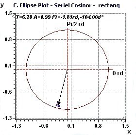
Figure 1.3-a : Confidence ellipse plot with rectangular function of period 2Pi, p = 0.95 means CI = 95% α = 0.05.
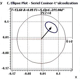
Figure 1.3-b : Confidence ellipse plot Temperature / Alcoholic subjects with period of 13.6 hours, p = 0.95 means CI = 95%, α = 0.05.
1.4 - Population Mean Cosinor – Confidence ellipse according to Nelson et al., Bingham et al.
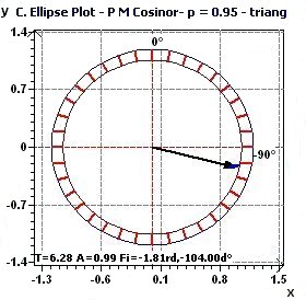
Figure 1.4-a : Confidence ellipse plot with triangular function of period 2Pi, p = 0.95 means CI = 95%, α = 0.05.
|
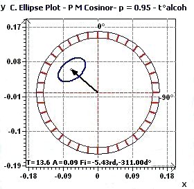
Figure 1.4-b : Confidence ellipse (Temperature / Alcoolized subjects with period of 13.6 hours, CI = 95%)
|
1.5 - Population Mean Cosinor – Reverse Elliptic Spectral plot according to Gouthière

Figure 1.5-a : Reverse elliptic spectral plot for an interval of given periods and a level of probability (Triangular function of period 2Pi, p = 0.95 means CI = 95%, α = 0.05)
1.6 - Population Mean Cosinor – Percent Rhythm spectral plot

Figure 1.6-a : Spectral plot of Percent Rhythm for a given interval of time and a given probability (Triangular function of period 2Pi, p = 0.95 means CI = 95%, α = 0.05)
1.7 - Population Mean Cosinor - Model and experimental point curves

Figure 1.7-a : Model, experimental points curves (Body temperature / Alcoholic subjects)
1.8 - Population Mean Cosinor – Residues Normal probability plot according to Chambers

Figure 1.8-a : Residues Normal probability plot Population Mean Cosinor (Alcoholic subjects, period of 13.6, p = 0.95, α = 0.05)
1.9 - Population Mean Cosinor - Chronogram and confidence intervals

Figure 1.9-a : Chronogram and confidence intervals: Phase and amplitude.
2.1 - Single Cosinor - Tests for one period
Figure 2.1-a : Single Cosinor: Abstract of Single Cosinor tests (Triangular function of period 2Pi, p = 0.95 means CI = 95%, α = 0.05)
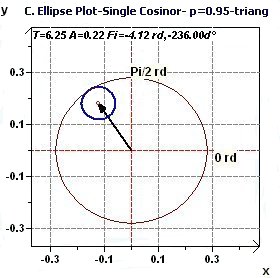
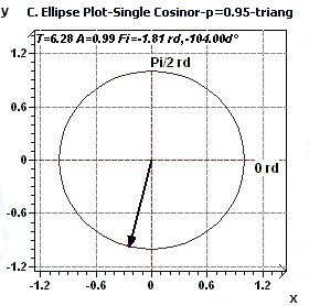
2.2 - Single Cosinor – Confidence ellipse according to Gouthière and Jacquin
|
|
Figures 2.2-a : Confidence ellipse (Triangular function of period 2Pi, p = 0.95 means CI = 95%, α = 0.05)
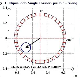
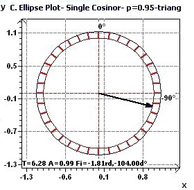
2.3 - Single Cosinor – Confidence ellipse according to Nelson et al. and Bingham et al.
|
|
Figures 2.3-a : Confidence ellipse according to Halberg et al. for a triangular function of period 2Pi (p = 0.95 means CI = 95%, α = 0.05)
2.4 - Single Cosinor – Spectral plot of Percent Rhythm according to Gouthière

Figure 2.4-a : Spectral plot of Percent Rhythm at an interval of a given periods and at a given probability for a triangular function of period 2Pi (p = 0.95 means CI = 95%, α = 0.05)
2.5 - Single Cosinor – Model and experimental points curves

Figure 2.5-a : Model and experimental points curves for a cosine function with 3 periods: 8, 12, 24.
2.6 - Single Cosinor – Reverse Elliptic Spectral plot according to Gouthière

Figure 2.6-a : Reverse Elliptic Spectral plot for a triangular function of 2Pi period (p = 0.95 means CI = 95%, α = 0.05)
2.13 - Single Cosinor – Chronogram and confidence intervals

Figure 2.13-a : Chronogram and confidence intervals: CI of the phase and CI of the amplitude (rats)
2.11 - Single Cosinor – Chronobiologic Window according to Halberg et al.

Figure 2.11-a : Chronobiologic Window (Allows to detect the period by the study of the residues variance as a function of time) Example of a triangular function of period 2Pi.
2.7 - Single Cosinor – Residues Normal Probability plot according to Chambers

Figure 2.7-a : Normal probability plot on the residues of the Single Cosinor Model (Alcoholic subjects, Period of 24.7, p = 0.95, α = 0.05)
2.8 - Single Cosinor – Complex Amplitude Demodulation plot according to Gouthière.

Figure 2.8-a : Complex Amplitude Demodulation plot (The aim is to verify the amplitude to be a constante)
2.9 - Single Cosinor – Complex Phase Demodulation plot according to Gouthière

Figure 2.9-a : Complex Phase Demodulation plot (The aim is to verify the phase to be a constante)
2.10 - Single Cosinor – Variance Homogeneity plot according to Draper and Smith

Figure 2.10-a : Variance Homogeneity plot.
2.12 - Single Cosinor – Comparison of rhythms, comparison of chronobiometric parameters according to Bingham et al.
Tableau 2.12-a : Comparison of rhythms (MESOR, Amplitude and Acrophase) of different series
for one period chosen (and a given probability) according to Bingham et al (Study of the Cortisol, period of
24.4 hours, p = 0.95 means CI = 95%, α = 0.05)
2.13 - Single Cosinor – Amplitude variation

Figure 2.13 : Amplitude variation of a sum of functions of periods 24, 12, 8. In blue the Ellipse test, the line of Amplitude. In red curves of
confidence intervals of the amplitude. (p = 0.95 means CI = 95%, α = 0.05)
2.14 - Single Cosinor – Phase variation

Figure 2.14 : Phase variation of a sum of functions of periods 24, 12, 8. In blue the Ellipse test, the line of Phase. In red curves of
confidence intervals of the phase. (p = 0.95 means CI = 95%, α = 0.05)
3.1 - Time series analysis – Lag plot
|
|
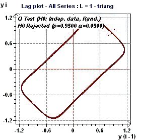
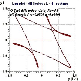
Figures 3.1-a : Lag Plot (triangular function of period 2Pi and rectangular function of period 2Pi, p = 0.95, α = 0.05)
A lag plot checks whether a data set or time series is random or not. Random data should not exhibit any
identifiable structure in the lag plot. Non-random structure in the lag plot indicates that the underlying data
are not random (EDA Graphical Techniques 1.3.3.15.
Lag Plot, Engineering Statistics Handbook) A complementary test of Ljung and Box (Q test) check the assumption of "Independent Data".
3.2 - Time series analysis – Autocorrelation plot

Figure 3.2-a : Autocorrelation plot (Triangular function of period 2Pi)
Autocorrelation plots (Box and Jenkins, pp. 28-32) are a commonly-used tool for checking randomness in a data set.
This randomness is ascertained by computing autocorrelations for data values at varying time lags. If random, such
autocorrelations should be near zero for any and all time-lag separations. If non-random, then one or more of the
autocorrelations will be significantly non-zero
(EDA Graphical Techniques
1.3.3.1. Autocorrelation Plot, Engineering Statistics Handbook) A confidence interval
is calculated and shows on the plot the band of randmoness (close to the zero x axis)
3.14 - Time Series Analysis – Partial Autocorrelation Plot (PACF)

Figure 3.14-a : Partial Autocorrelation Plot (Triangular function of period 2Pi)
The data are not random. The PACF allows to verify is data are randomn. It is also use to determine the order
of an autoregressive model...
(Cf. EDA Graphical Techniques6.4.4.6.3. Partial Autocorrelation Plot, Engineering Statistics Handbook)
3.3 Time series analysis – Spectral Density plot according to Blochner

Figure 3.3-a : Normalized Spectral density plot (Triangular function of period 2Pi)
3.4 - Time series analysis – Autospectral plot according to Jenkins and Watts

Figure 3.4-a : Autospectral plot (Hanning window) according to Jenkins and Watts (Triangular function of period 2Pi)
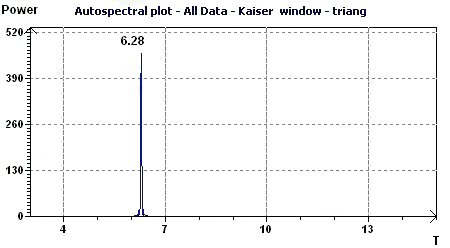
Figure 3.4-b : Autospectral plot (Kaiser window) according to Jenkins and Watts (Triangular function of period 2Pi)
|
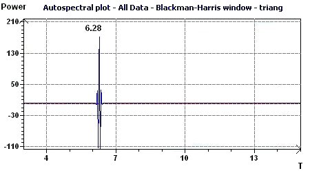
Figure 3.4-c : Autospectral plot (Blackman-Harris window) according to Jenkins and Watts (Triangular function of period 2Pi)
|
3.5 - Time series analysis – AutoPeriodogram plot according to Jenkins and Watts
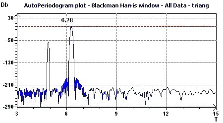
Figure 3.5-a : Spectral Autoperiodogram according to Jenkins and Watts (Triangular function of period 2Pi)
3.6 - Time series analysis – Periodogram plot according to Scargle
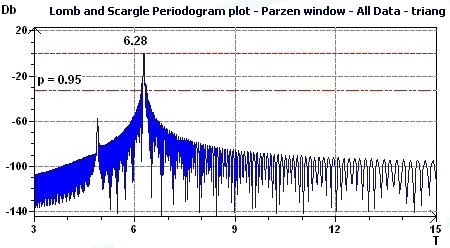
Figure 3.6-a : Periodogram plot according to Scargle (Triangular function of period 2Pi)
3.7 - Time series analysis – Discrete Fourier Transforms - Amplitude
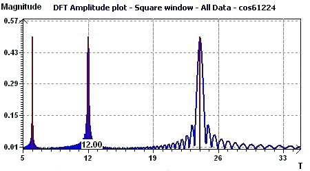
Figure 3.7-a : Discrete Fourier Transforms - Amplitude (Cosine function with periods 6, 12, 24, equispaced time data)
|
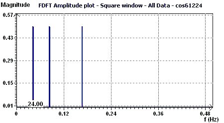
Figure 3.7-b : FFT - Amplitude (Cosine function with periods 6, 12, 24, equispaced time data)
|
3.8 - Time series analysis – Fisher periodogram

Figure 3.8-a : Fisher periodogram. Test of the fundamental ray (rats)
3.13 - Time series analysis – Fourier periodogram and Cumulative Fourier Periodogram according to Schuster

Figure 3.13-a : Fourier Periodogram (Sum of cosine functions of periods 8, 12, 24)

Figure 3.13-b : Cumulative Fourier Periodogram (Sum of cosine functions of periods 8, 12, 24)
3.15 - Time series analysis – Maximum Entropy Spectral Analysis according to Burg MESA

Figure 3.15-a : MESA spectrum of sum of cosine functions of periods 8, 12, 24.
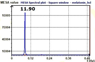
Figure 3.15-b : MESA spectrum of plasma melatonin.
3.9 - Normal probability plot according to Chambers

Figure 3.9-a : Normal probability plot of experimental data (Temperature / Alcoholic subjects)
The normal probability plot (Chambers 1983) is a graphical technique for assessing whether or not a data set is approximately normally distributed.
The data are plotted against a theoretical normal distribution in such a way that the points should form an approximate straight line. Departures from this straight line indicate departures from normality...
(EDA Graphical Techniques 1.3.3.21. Normal Probability Plot, Engineering Statistics Handbook)
A complementary Komolgorov-Smirnov test (K-S test) is used to test this assumption with a level of probability p (or risk 1 -p)
3.10 - Scatter plot according to Chambers

Figure 3.10-a : Scatter plot of experimental data with a linear trend (Temperature / Alcoholic subjects)
A scatter plot (Chambers 1983) reveals relationships or association
between two variables. Such relationships manifest themselves by any non-random structure in the plot
(EDA Graphical Techniques 1.3.3.26. Scatter Plot, Engineering Statistics Handbook)
3.11 - Run Sequence plot according to Chambers

Figure 3.11-a : Run Sequence plot. With run sequence plots, shifts in location and scale are typically quite
evident. Also, outliers can be easily detected (EDA Graphical Techniques 1.3.3.25. Run Sequence Plot, Engineering Statistics Handbook)
3.12 - Box plot according to Chambers

Figure 3.12-a : Box plot according to Chambers for the study of temperature in subjects with placebo (alcoholic study)
The Box plot can provide answers to the following questions : 1) Is a factor significant ?, 2) Does the location differ between
subgroups ?, 3) Does the variation differ between subgroups ?, 4) Are there any outliers ?
The Box plot is an important EDA tool for determining if a factor has a significant effect on the response with
respect to either location or variation and is also effective for summarizing large quantities of
information (EDA Graphical Techniques 1.3.3.7. Box Plot, Engineering Statistics Handbook)

