2 - Rectangular wave: sin(t) + sin(3t)/3 + sin(5t)/5 with a period of 2Pi
In this example, we used Population Cosinor methodology. An overall model was calculated based on the series set using vectorial average of the models
of each series. For each figure, p was fixed at 0.95, CI = 95% and p = 1-p or 0.05.
This type of modelling is commonly used to determine population characteristics.
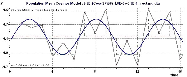
Figure 2-a : The model, the experimental points and the interpolation curve (modelling by "Population Mean Cosinor") shows one
of the detected periods is 2Pi (6.28).
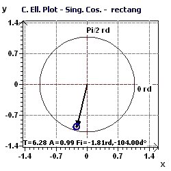
Figure 2-b : Population Mean Cosinor and associated tests on the overall model (p fixed 0.95, means confidence interval = 95%, α = 0.05)
Figure 2-c : Period of 2Pi. The confidence ellipse of the Serial Cosinor according to Gouthière and Jacquin (The smaller the surface, the greater the precision in determination of the period)
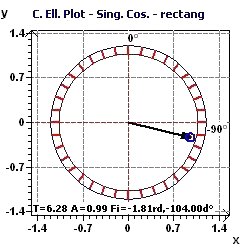
Figure 2-d : Period of 2Pi. The confidence ellipse of the "Population Mean Cosinor" according to Nelson et al and Bingham et al
(The smaller the surface, the greater the precision in determination of the period)
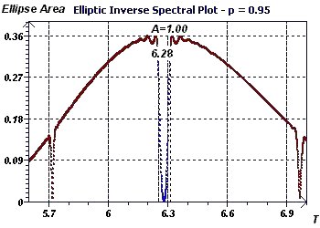
Figure 2-e : Initial period of 2Pi. The Reverse Elliptic Spectral plot according to Gouthière, makes it possible to
detect periods. Here it shows a minimum at 6.28. The part in blue corresponds to the significance of the null hypothesis in the ellipse test.
By increasing probability, we constrain the interval of valid periods.
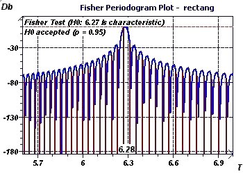
Figure 2-f : Initial period of 2Pi. The Fisher Periodogram makes it possible to detect a period and its validity using a fixed
probability. It is a method derived from DFT. It tests the baseline (fundamental at 6.27 here) using as a null
hypothesis that this is characteristic of the phenomenon being studied at a given probability (This spectral analysis is less interesting
than the Scargle periodogram or the Jenkins and Watts Autoperiodogram)
3 - Saw tooth wave: sin(t) + sin(2t)/2 + sin(3t)/3 with a period of 2Pi
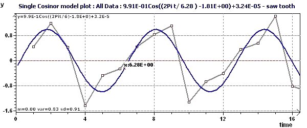
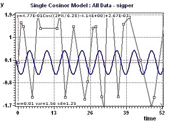
In this example, we used Single Cosinor methodology. An overall model was calculated based on the set of all the points
belonging to the series set. For each figure, p was fixed at 0.95, CI = 95% and p = 1-p or 0.05.
This type of modelling is commonly used to determine subject characteristics.
Figure 3-a : The model, the experimental points and the interpolation curve. The detected periods is 2Pi (6.28)
Figure 3-b : Single Cosinor and associated tests on the models where the period is 2Pi.
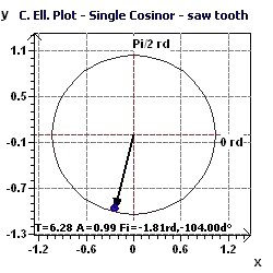
Figure 3-c : Period of 2Pi. Representation of the confidence ellipse according to Gouthière and Jacquin.
Figure 3-d : Period of 2Pi. The confidence ellipse according to Nelson et al. and Bingham et al. (The smaller the surface, the greater the precision in determination of the period)
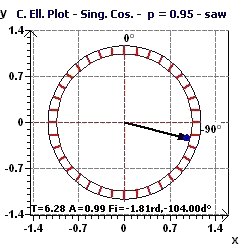
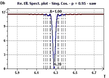
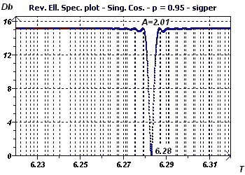
Figure 3-e : The elliptic inverse spectrum according to Gouthière presents a minimum at 6.28. The blue part corresponds to the significance of the
null assumption of the ellipse test for a given probability.
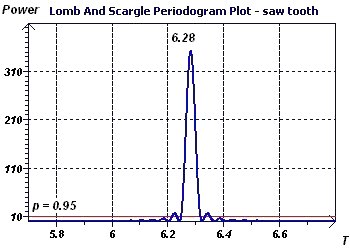
Figure 3-f : The periodogram of Scargle allows us to highlight a period (6.28) identical to that obtained by the
previous method.
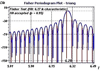
4 - Triangular wave: sin(t) - sin(3t)/3² + sin(5t)/5² of period 2Pi
In this example, we show several methods to detect periods, and compare those results to the Reverse Elliptic Spectral (RES) plot according to Gouthiere.
For each figure, p was fixed at 0.95, CI = 95% and p = 1-p or 0.05. The high quality of the data allowed us to find the
same results consistently. This, of course, is not always possible.
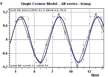
Figure 4-a : One of the detected periods is one of 2Pi (6.28) Representation of the model and the experimental points.
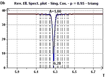
Figure 4-b : The Reverse Elliptic Spectrum presents a minimum at 6.28 for a probability fixed at 0.95, means confidence interval = 95%, (α = 1-p) corresponding the period (In
blue is the validity zone for the ellipse test, these are the confidence limits of the period)
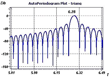
Figure 4-c : The periodogram according to Jenkins and Watts provides the same result, (6.28), although the method is completely different
from regression and instead calculates the Fourier transforms of the autocorrelation function.
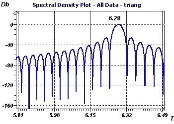
Figure 4-d : Spectrum analysis according to Blochner, but adapted to stationary phenomena, leads to the same result.
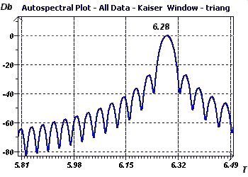
Figure 4-e : Autospectrum analysis according to Jenkins and Watts, consisting of a classic spectrum analysis, (here with a Kaiser
window), gives a result of 6.28.
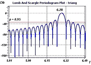
Figure 4-f : The Scargle periodogram confirms the previous results of 6.28 (2Pi).
Figure 4-g : The Fisher periodogram tested a baseline or fundamental ray of 6.27.
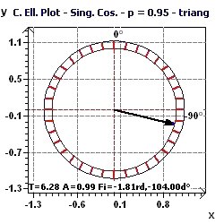
Figure 4-h : Confidence ellipse plot with a very small area of the ellipse indicating high accuracy in determination of the period.
5 - Periodic wave: sin(t) + sin(3t) + sin(5t)/5 + sin(3t)/3² + sin(5t)/5² with a period of 2Pi
In this example, we compare the Inverse Elliptic Spectral plot from the Single Cosinor with the spectrum
of rays from the Rapid Fourier Transforms.
Figure 5-a : The Single Cosinor Model and the experimental points show one of the detected periods is 2Pi (6.28).
Figure 5-b : Inverse Elliptic Spectral plot from the Single Cosinor. It determines the exact value of the period.
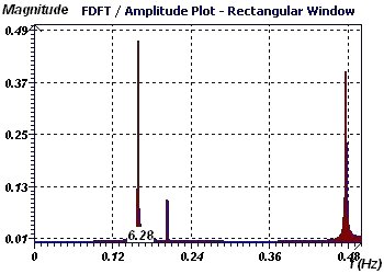
Figure 5-c : Rapid Fourier Transforms. The spectral plot of rays shows a baseline or fundamental ray at 6.28 (2Pi).
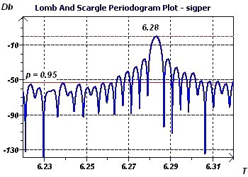
Figure 5-d : The Scargle Periodogram found the exact period of 2Pi, shown as the highest peak.
6 - Temperature and alcoholism (Source : Danel, CHRU Lille, France)
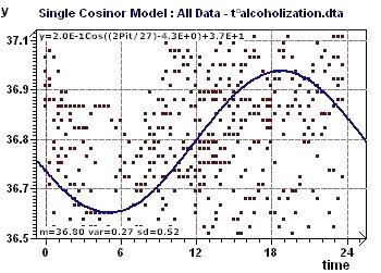
In this study, we looked for periods corresponding to temperature rhythms in data from alcoholic and control subjects and then constructed a model.
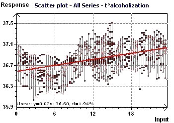
Figure 6-a : The linear trend is slowly increasing and highlights body temperature with time in alcoholic subjects.
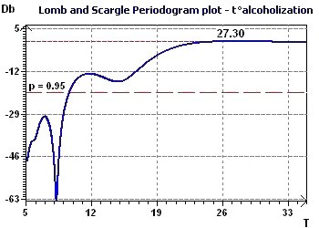
Figure 6-b : The Scargle periodogram found a main period close to 27 hours in alcoholic subjects.
Figure 6-c : The model for alcoholic subjects was then constructed using the previous period, 27.3 h, but without detrending the data.
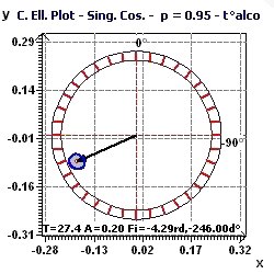
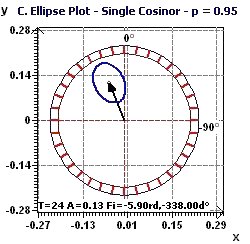
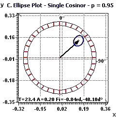
Figure 6-d : Confidence ellipse, according to Nelson et al and Bingham et al, for the period of 27 hours. The acrophase is close to 6:40 PM.
Figure 6-e : Single Cosinor and associated tests for the period of 27.3 hours for temperature variability in alcoholic subjects.
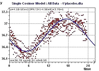
Figure 6-f : The linear trend is increasing body temperature followed by a slow decrease with time in control subjects. The main period of
just over 24 hours was found by spectral analysis.
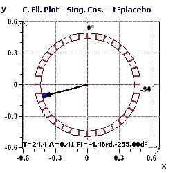
Figure 6-g : Confidence ellipse for the period of 24.4 hours in control subjects. The acrophase is close to 5:20 PM.
Figure 6-h : Temperature/Placebo: Single Cosinor and associated tests for a period of 24.5 hours.
7 - Plasma cortisol (Source : Brun, HC, Radioanalysis, RadioPharmacy Laboratory, Lyon France)
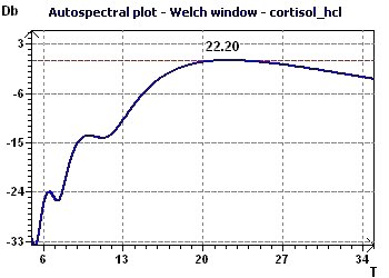
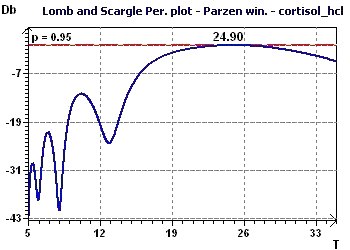
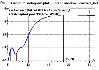
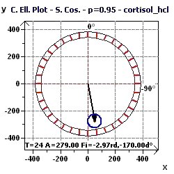
In this study, we show the main periods of plasma cortisol.
Figure 7-a : The Autospectral plot (Jenkins and Watts) shows a main period peak close to 22 hours.
Figure 7-b : The Scargle periodogram found a main period peak close to 24.9 hours.
Figure 7-c : The Fisher periodogram finds a fundamental period close to 24 hours.
Figure 7-d : The Single Cosinor confidence ellipse for a period of 24 hours.
8 - Plasma melatonin (Source : Brun, HC Radioanalysis, RadioPharmacy Laboratory, Lyon France)
In this study, we searched a data sample for the periods of plasma melatonin. It is difficult to consider periods higher than 24 hours
as significant, partly due to their variability and to the specificity of the group of subjects under the given conditions.
The plasma melatonin peak is expected to be close to 27 hours or 3 hours.
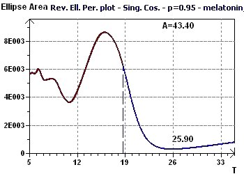
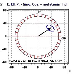
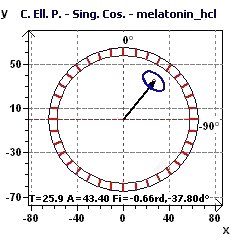
Figure 8-a : The Reverse Elliptic Spectrum (RES) determines the main peak of a period close to 25.9 hours (p = 0.95, means confidence interval 95%, p = 1-p)
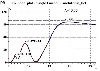
Figure 8-b : The Percent Rhythm spectrum determines the period as close to 25.6 hours.
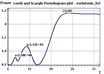
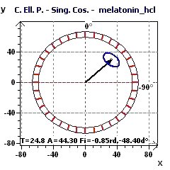
Figure 8-c : The Scargle periodogram shows a main period peak of period close to 24.8 hours.
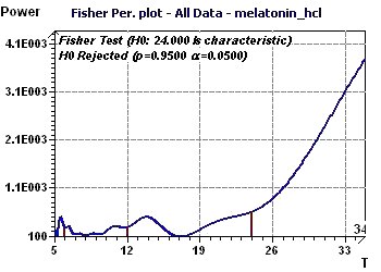
Figure 8-d : The Fisher periodogram determines one fundamental period of 24 hours and a first harmonic of 12 hours. (H0 rejected means that the period of 24
hours is not confirmed)
Figure 8-e : Confidence ellipse plot for a period of 24 hours (p = 0.95, means confidence interval 95%, p = 1-p) according to Nelson et al and Bingham et al.
Figure 8-f : Confidence ellipse plot for a period of 24.8 hours (p = 0.95, means confidence interval 95%, p = 1-p) according to Nelson et al. and Bingham et al.
Figure 8-g : Confidence ellipse plot for a period of 25.9 hours (p = 0.95, means confidence interval 95%, p = 1-p) according to Nelson et al. and Bingham et al.
22 - Transformed fibroblast proliferation rate (Source : Deschatrette, INSERM U347, France)
In this study we show the main period of the proliferation rate of transformed fibroblasts.
Figure 22-a : The main periodicity is shown by the Reverse Elliptic Spectrum. As an example of the application of this new method,
we show here the cell proliferation rate in culture for human fibroblasts whose life was extended by the action of the T-SV40 gene (Confidence interval:
Vertical dashed black lines, p = 0.95, means confidence interval 95%, p = 1-p)
Figure 22-b : The same main periodicity is shown by the Scargle periodogram plot.
23 - Methotrexate action on cellular resistance and telomere length (Source : Deschatrette, INSERM U347, France)
This phenomenon consists of a modification of the structure of telomere ends. The number of base pairs at the telomere end decreases continuously
when methotrexate is present, until a minimum base pair number is reached and methotrexate activity ends. This erosion phase lasts for two to three
months and it is followed by a repair phase which lasts approximately two months. Here, we determine the period characteristics of this phenomenon where
number of resistant cells is a function of telomere length (in thousands of base pairs or kilo base pairs: kbp)
Figure 23-a : A periodicity seems to be present.
Figure 23-b : Autocorrelation curve: The part of the curve outside the zone defined by the dash and dotted lines is a random phenomenon
which is, nevertheless, in a zone that can be characterized as a Moving Average (p = 0.95, p = 0.05).
Figure 23-c : Reverse Elliptical Spectral plot: The period is 0.18 kilo base pairs.
Figure 23-d : The MESA spectrum (Maximum Entropy Spectral Analysis) shows a period of 0.34 kilo base pairs.
10 - Daily morning temperature of an adult woman
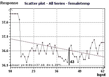
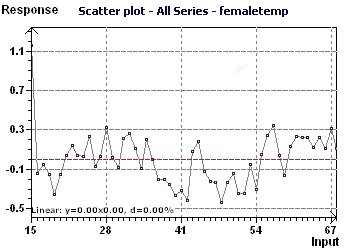
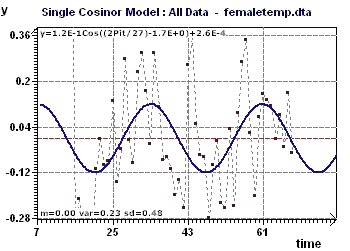
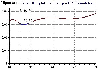
Temperatures were recorded from day 10 (July 10) to day 69 (Sept. 07). Spectral analysis shows a period close to 28 days.
The peak on day 43 apparently corresponds to ovulation. The Scatter plot shows that the first 4 or 5 points are
"outliers" and not necessary to calculate the periods of the temperature. These first points, nevertheless, have a physiological interest.
Figure 10-a : The Scatter plot reveal the behavior of the temperature curve with some "outliers"
Figure 10-b : The outliers were removed and a linear detrend performed.
Figure 10-c : Model with a period of 27 days. The second order period was revealed by substracting the signal
from the first part of the fundamental period.
Figure 10-d : Reverse Elliptic Spectrum according to Gouthière, shows the 2nd order period of 27 days is found after treatement of the first signal.
11 - The number of monthly sunspots from 1900 to 1983 (Source : Andrews and Herzberg)
This study makes it possible to find periods for sunspots observed in Zurich from 1900 to 1983 (Andrews and Herzberg 1985)
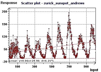
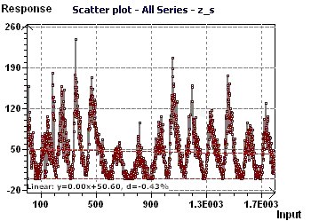
at a rate of one observation according to month. The data is equispaced in time, any type of spectral analysis may be used. The "Scatter plot" allows
visualization of the general distribution of the points, where the sinusoidal character is quite clear.
Then, two spectral analyses, based on completely different principles were used. The "scatter plot" allows visualization of the general
distribution of the points, where the sinusoidal character is quite clear.
Then, two spectral analyseis, based on completely different principles, were used.
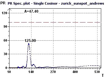
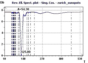
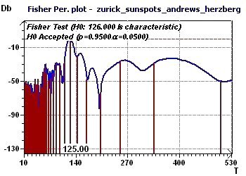
One led to the determination of a "fundamental" ray of common value and the other to a maximum peak. Both suggest a periodicity of 123 to 125 months
for observation of the sunspot phenomenon.
Figure 11-a : Scatter plot enables visualization of the general distribution of the points. A sinusoidal character seems present.
Figure 11-b : A Percent Rhythm spectral plot found a peak at 125 months (10.4 years)
Figure 11-c : A Reverse Elliptic Spectrum, according to Gouthière, found a maximum peak at 125 months (10.4 years).
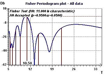
Figure 11-d : A Fisher periodogram found and tests a fundamental ray at 126 months (10.5 years)
12 - The number of monthly sunspots from 1749 to 1899 (Source : Andrews and Herzberg)
This study looked for periods for sunspots observed in Zurich from 1749 to 1899 (Andrews and Herzberg 1985) at a rate of one measurement according to month.
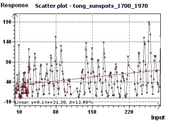
Since the data is equispaced in time, any kind of spectral analysis may be used. The "Scatter plot" allows visualization of the general distribution of the points,
where the sinusoidal character is quite clear. Then two spectral analyses based on completely different principles led to the determination
of a "fundamental" ray or peak of common value.
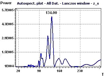
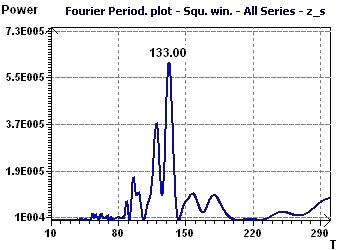
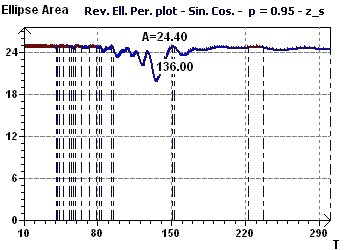
One can thus deduce that in these years the frequency of the sunspot phenomenon followed a periodicity of 133 to 136 months.
Figure 12-a : Scatter plot enables visualization of the general distribution of the points. A sinusoidal character seems present.
Figure 12-b : Autospectral Spectrum according to Jenkins and Watts found a maximum peak at 134 months (11.2 years).
Figure 12-c : The Fourier periodogram found a fundamental ray at 133 months (11.1 years)
Figure 12-d : A Reverse Elliptic Spectrum according to Gouthière, found a mininmum peak at 136 months (11.3 years)
13 - Yearly sunspots from 1700 to 1979 (Source : Tong)
This study looked for periods for sunspots observed from 1700 to 1979 (Tong 1983) at a rate of one observation according to year.
Since the data is equispaced in time, any kind of spectral analysis may be used. The "Scatter plot" allows visualizeation of the general distribution
of the points where the sinusoidal aspect is quite clear. Then, two types of spectral analyses based on completely different principles led to the
determination of a "fundamental" ray of common value. One can thus deduce from it that in these years, the frequency of the sunspot phenomenon followed
a periodicity of 10 to 10.8 years i.e. 120 to 130 months. These results confirm those obtained in examples 10 and 11, which is remarkable.
Figure 13-a : Scatter plot enables visualization of the general distribution of the points. A sinusoidal character seems present.
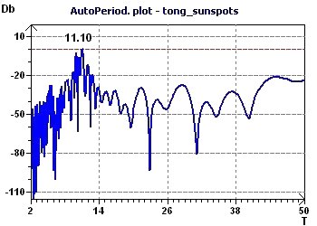
Figure 13-b : An autoperiodogram according to Jenkins and Watts found a maximum peak at 11 years (132 months)
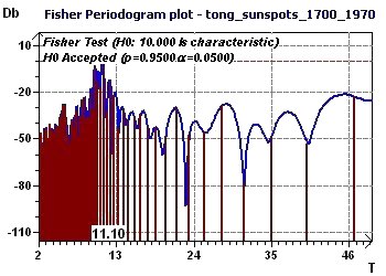
Figure 13-c : A Fisher periodogram found one fundamental ray at 10 years (120 months) (p = 0.95, p = 1-p).
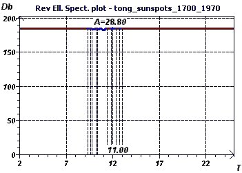
Figure 13-d : A Reverse Elliptic Spectrum according to Gouthière, found a minimum peak at 11 years (132 months)
14 - The "American" number of monthly solar sunspots from 1945 to 2000 (Source : National Geophysical
Data Center, US Department of Commerce)
This study confirms the preceding studies, revealing a period of close to 11 years for a cycle of solar activity.
This conforms with what is commonly known about periods of sunspots (see Fourier Analysis of Time Series, Peter Bloomfield, p. 77)
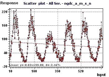
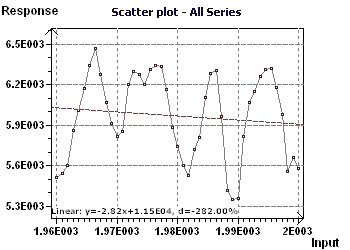
Figure 14-a : A Scatter plot enables us visualization of the general distribution of the points. A sinusoidal character is present,
and the linear trend is decreasing.
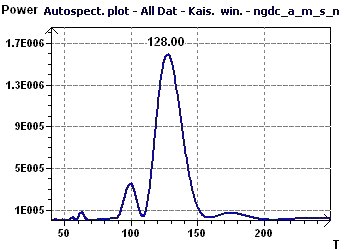
Figure 14-b : An Autospectral analysis, according to Jenkins and Watts shows a maximal peak of 127/12 (10.58), close to 11 years.
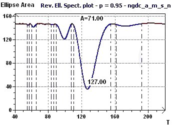
Figure 14-c : A Reverse Elliptic Spectrum, according to Gouthière shows a minimal peak of 128/12 (10.7), or more than 10 years. Other, smaller peaks
indicate smaller periods.
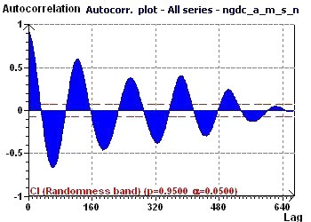
Figure 14-d : The Autocorrelation plot is characteristic of a periodic curve that is sinusoidal and with decreasing amplitude.
15 - Yearly average of cosmic rays from 1958 to 2002 in Kiel, Germany (Source : National Geophysical
Data Center, US Department of Commerce)
Examples 11 to 14 show that for number of sunspots, cycle of one period of solar activity ranges between 10 and 12 years. In this example,
we compare this period with another component of solar activity, cosmic rays, measured here in Kiel, Germany. Here, the period is revealed to be
10.5 to 11 years.
Figure 15-a : A Scatter plot enables visualization of the general distribution of the points. A sinusoidal character seems present and the
linear trend is decreasing.
Figure 15-b : A Fisher Periodogram shows a fundamental ray at 11 years (p = 0.95, p = 1-p)
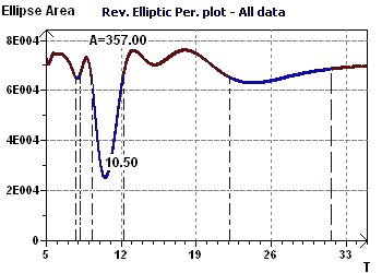
Figure 15-c : A Reverse Elliptic Spectrum, according to Gouthière highlights a fundamental ray at 10.5 years.
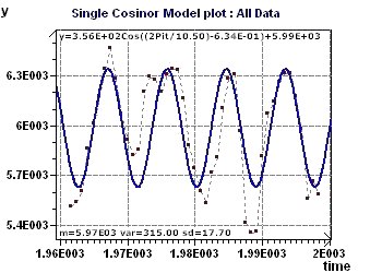
Figure 15-d : A Cosine model (y=3.56E+2Cos((2Pit/10.50)
-6.34E-01)+5.99E+3) with a period of 10.5 years.
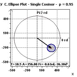
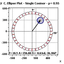
Figure 15-e : A Single Cosinor confidence ellipse with phase = -0.63 rd, and amplitude = 356, following international counterclockwise
units.
Figure 15-f : A Single Cosinor confidence ellipse with phase = -0,63 rd, -36.,3 degree, and amplitude = 356, according to Nelson et al., and Bingham et al.
16 - Velocity of money in the, U.S. economy, 1869-1937, (Source : Friedman and Schwartz)
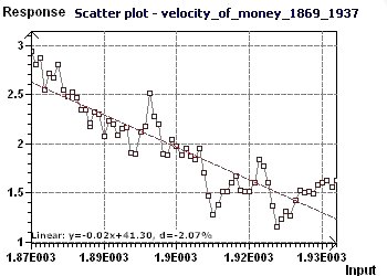
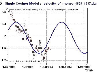
In this example, we looked for the seasonal periodicity of the velocity of money, then plotted the forecasting model.
The econometric curves in this case allowed use of an ARIMA(n, m) model, shown by the strong dependent data in the Lag plot where the values of n and m
can be determined by autocorrelation and the PACF curves.
Figure 16-a : The Scatter plot displays the main distribution of the data. A sinusoidal character seems to be present.
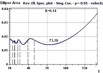
Figure 16-b : The Reverse Elliptic Spectrum allows us to determine several seasonal periods, including a marked one of 73.2 years.
(The data were detrended before searching for the main period)
Figure 16-c : This plot is the forecasting model of monetary velocity, up to approximately 2000, showing the period of 73.2 years.
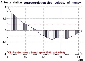
Figure 16-d : The Autocorrelation plot helps to verify that the distribution is not random. In fact, the data are highly correlated.
17 - Variations in the price of copper in the USA, 1800-1997 (Source : Makridakis, Wheelwright and Hyndman)
After determination of the period, the model for 1800 to 1997 was built and then a predictive model which gives examples of variations for 2000, 2010 etc.
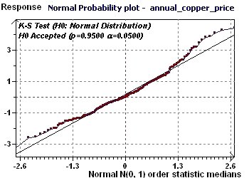
Figure 17-a : The distribution of the data is Normal and then seems to be stochastic.
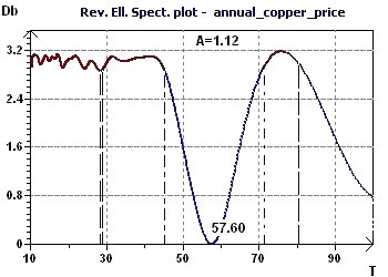
Figure 17-b : The Reverse Elliptic Spectrum (RES) highlights several periods including one more marked at 57 years.
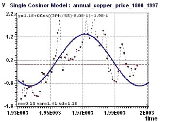
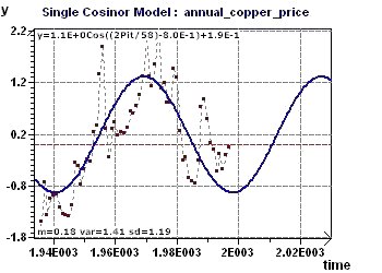
Figure 17-c : The sinusoidal model built with all the points from 1800 to 1997 and the selected period of 57.7 years.
Figure 17-d : The sinusoidal model extended until 2100 with calculated predicted values 2000, 2010, 2020 and 2040.
19 - Temperature, physical training and night shift work (Source : Mauvieux, CRAPS/STAPS/INSERM U1075, Caen, France)
In this example, we have two temperature samples from the same population. The first is sedentary subjects with night shift work and,
the second the same subjects after a few weeks of physical training. The physical training modified the temperature curves;
particularly the amplitude, which became more marked and the phase change, which decreased. A complementary study suggested that amplitude
remains constant and that phase seems is a time function.
Figure 19-a : Before physical training : the confidence ellipse with associated chronobiological values shows
acrophase close to 10:25 PM. (p = 0.95, means confidence interval = 95%, p = 0.05)
Figure 19-b : After physical training, amplitude increased, phase decreased and the confidence ellipse shows acrophase close to 3:10 AM.
(p = 0.95, means confidence interval = 95%, p = 0.05)
Figure 19-c : Before physical training amplitude variations seems to be a constant and not a time function.
Figure 19-d : Before physical training phase variations do not seem to be a constant rather the phase seems a complex function of time
and possibly even periodic.
20 - Annual wages in the U.S. from 1900 to 1970 (Source : Hipel and McLeod)
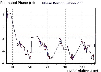
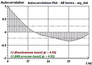
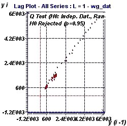
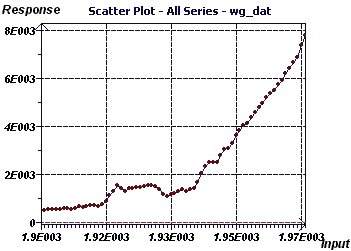
This time series example illustrates a strong autocorrelation of the data. Here, the best adapted model is also identified.
Figure 20-a : The Autocorrelation plot shows a strong autocorrelation.
Figure 20-b : The Lag plot describes a linear form which excludes the assumption of data ranmdomness and is typical of an Autoregressive
process (AR). A Ljung Box test (Q test) verified the assumption of independent data.
Figure 20-c : The Scatter plot illustrates an apparently exponential wage curve. There is no observable variation between scales nor
any outliers.
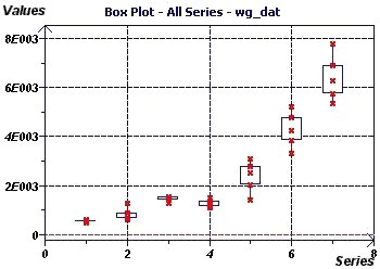
Figure 20-d : The Box plot also illustrates exponential growth and shows increasing inter-quartile variation every decade. No outliers are seen.
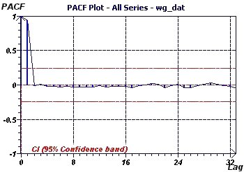
Figure 20-e : The PACF ("Partial Autocorrelation Function") graph shows a significant value for 1, suggesting an Autoregressive
process of order 1 or AR(1) as the best adapted model.
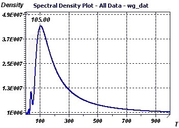
Figure 20-f : The spectral analysis according to Blochner shows a single high peak of frequency close to 0 that confirms AR process model as most suitable.
21 - Monthly temperature in England from 1900 to 1970 (Source : Hipel and McLeod)
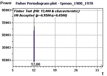
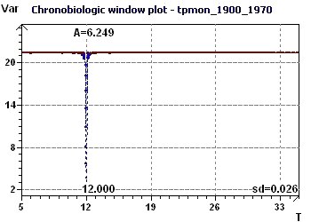
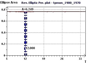
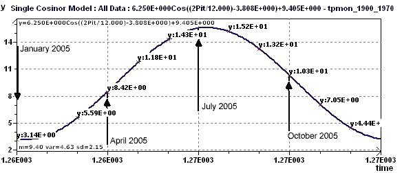
This example used various methods which unanimously showed an incontestable period of about 12 months (circannual, seasonal change). The Single Cosinor test
gave the characteristic parameters of this rhythmic phenomenon and allowed deduction of a temperature forecasting curve for the year 2005. The data were
detrended before analysis to keep only the periodic part of the signal. The linear trend showed a weak slope.
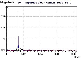
Figure 21-a : The Fourier Transforms confirm the Fisher periodogram fundamental of 12 months period.
Figure 21-b : The Fisher periodogram 12 months period is characteristic of one existing rhythm (p = 0.95, p = 1 -p).
Figure 21-c : The Halberg Chronobiologic Window highlights the 12 month period.
Figure 21-d : The Reverse Elliptic Spectrum (RES) finds a single 12 month period.
Figure 21-e : The Single Cosinor tests characterize a rhythmic phenomenon with a 12 month period.
Figure 21-f : A theoretical forecast curve of the means temperatures in England in 2005 (January 2005 is the 1261st month from January 1900)


